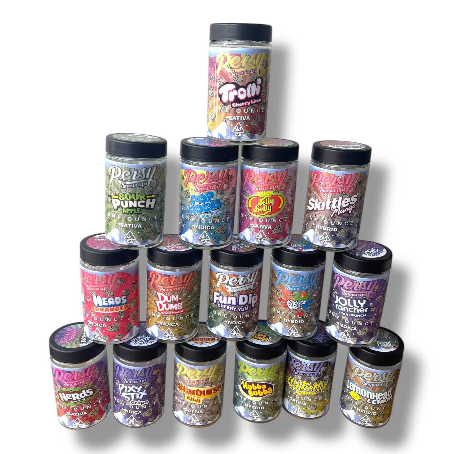
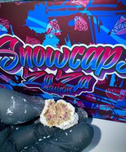
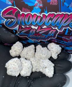
Percy Snowcaps Ounce Jars
$180.00
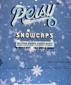
Percy Snowcaps is more than a name — it’s a legend carved in ice. It channels the unstoppable energy of a linebacker charging through the line, fused with the cool serenity of alpine winds. This strain identity is about power meeting peace, a balance of boldness and calm.
Brand Essence
Percy Snowcaps is more than a name — it’s a legend carved in ice. It channels the unstoppable energy of a linebacker charging through the line, fused with the cool serenity of alpine winds. This strain identity is about power meeting peace, a balance of boldness and calm.
- 🌬️ Aroma Concept: Crisp, frosty notes with a hint of pine and mint — like breathing in mountain air.
- ❄️ Flavor Concept: Smooth, refreshing, with icy undertones that linger like snowflakes melting on your tongue.
- 🏔️ Experience Concept: A steady climb to clarity, followed by a plateau of calm strength.
Visual Identity
- Colors: Icy blues, silvers, and deep forest greens
- Symbols: Snowflakes, mountain peaks, bold geometric lines
- Typography: Strong, angular fonts with frosted textures
Lifestyle Positioning
Percy Snowcaps is crafted for those who seek elevation without chaos. It’s the brand for thinkers, creators, and athletes of the mind — people who want to stand tall, stay cool, and move with purpose.
Campaign Ideas
-
- Slogan Series:
- “Climb higher. Stay cooler.”
- “Impact with precision. Chill with grace.”
- “From the gridiron to the glacier.”
- Slogan Series:
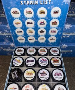
| Fruity-Flavors | Lemon Head, Skittles Mango, Starburst Kiwi, Sour Punch Apple, Trolli Cherry Lime, Orange Lychee, Fruit Punch, Fruit Gushers Tropical, Jelly Belly Peach, Dum-Dums Watermelon |
|---|---|
| Candy Flavors | Air Heads, Fun Dip Cherry Yum, Laffy Taffy Banana, Hubba Bubba, Nerds Strawberry, Pixy Stix Grape |
Be the first to review “Percy Snowcaps Ounce Jars”
Related products
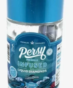
PERSY LIQUID DIAMONDS INFUSED PRE-ROLLS
PERSY LIQUID DIAMONDS INFUSED PRE-ROLLS
Premium-Edition
Persy Slabs Master Box
Premium-Edition
PERSY LIQUID DIAMONDS INFUSED PRE-ROLLS
Persy Diamonds Carts
Reviews
There are no reviews yet.